BMW 330e vs Volvo S60 T8: interior and infotainment
Both interiors are very nice places to spend time, but the BMW has the better infotainment system

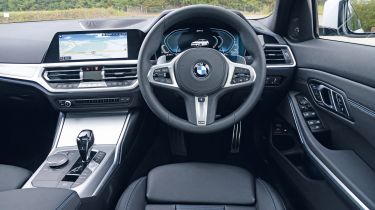
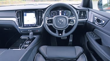
Both interiors look and feel plush enough to satisfy, even given the executive expectations they carry. The only major gripe we have with the BMW 330e is that you have to pay extra for powered seat adjustment and adjustable lumbar support, which you’ll want to do, as the manual seat adjustment is clunky and awkward.
Still, perceived quality is fantastic, from nicely damped switches to dense-feeling material textures; it’s good enough to make the Volvo feel a little low-rent in places. Having said that, the seats in the Volvo are second to none for comfort, and get power adjustment with lumbar support as standard, so it’s one up on the BMW there.
Visibility is a touch better than in the BMW, too, and the Volvo S60 oozes the simple-but-sumptuous design character that really sets the Swedish brand apart from its German counterparts.

Both cars are well equipped in terms of infotainment. The 330e gets BMW’s full-on 10.25-inch touchscreen and rotary-dial combination, complete with sat nav that’ll show you nearby charging points, an effective voice-control system and Apple CarPlay smartphone connectivity.
Frustratingly, Android Auto isn’t offered on BMWs currently, but our test car came with the £1,900 Technology Pack, which includes a head-up display (the best in the industry for clarity without disturbing your vision) and wireless phone charging.
The infotainment system in general is one of the best out there, with high-definition graphics and a responsive touchscreen, plus the rotary controller makes it easier to use on the move than the touchscreen-only interface in the Volvo.
The Volvo also has slightly dated graphics and, while its system is logical enough to use, it feels a generation behind the BMW. You also have to pay £300 to get Apple CarPlay and Android Auto. There’s no doubting that the BMW’s is the best system here and, indeed, in the class as a whole.


