Mazda MX-30 vs Kia Soul EV: interior & infotainment
The MX-30 has the nicer interior here, but Kia's infotainment system is better to use
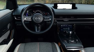
Mazda is very good at designing and building classy, well-finished interiors and the MX-30's is no exception. The overall design is cool, clean and straightforward, with simple lines that should age well. Mazda has taken particular care to include some eco-friendly materials throughout, including recycled plastics and cork. It's all very well put together and feels upmarket.
The infotainment setup feels minimalist by the standards of some other electric cars, such as the screen-filled Honda e; a driver's display and dash-top main screen (which could feel a little narrow and far away for some) are used in conjunction with a smaller touchscreen that sits on the centre console. This is mainly used for ventilation controls and works well.
Kia's interior design isn't quite as slick, but there's a clear focus on practicality in the Soul EV. It certainly feels far less modern than the exterior, with a more rounded design, but the build is solid.
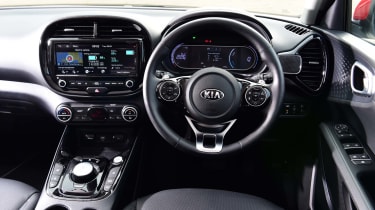
A large 10-inch central infotainment screen is paired with a smaller screen in place of traditional dials; Kia's infotainment system is clear, logical and responsive, but its graphics are starting to look a little dated next to those of newer rivals.
The inclusion of Apple CarPlay and Android Auto smartphone connectivity in both cars is good news: we still generally prefer using smartphone-based navigation rather than relying on built-in systems.
Standard equipment is good generally on both cars: the Kia is only available in well-equipped First Edition trim, with GT Sport Tech offering a comparable set of features on the Mazda. If you can do without some bells and whistles such as smart keyless entry, built-in sat nav and a 12-speaker stereo, there are savings to be made by going for entry-level SE-L Lux trim, which starts at just over £25,500.
