Honda e vs MINI Electric: interior and infotainment
The Honda is leagues ahead of the MINI in this department; both are well built, however

The Honda e has an interior that may well seal the deal for many: its retro-styled yet high-tech design is as close to a concept car's as we've seen in an electric car, never mind a small and relatively affordable one such as this. The dashboard is designed around two central 12.3-inch touchscreens, along with a driver's display and two smaller screens in place of door mirrors.
The system has the potential to overwhelm at first, but can be configured to display as much or as little information as you like, and makes sense once you've spent a bit of time with it. Clever features include anHDMI input to connect games consoles and streaming dongles, plus Apple CarPlay and Android Auto connectivity. If it all gets too much, you can dim or switch off the screens.
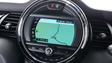
The MINI's interior is far more conventional, with two screens found in the usual places – one centrally mounted and another behind the steering wheel. Its infotainment system works well and is far less daunting than the Honda's, but it's hard to ignore the appeal of the Japanese car's show-stopping layout. The MINI's in-built sat-nav sports nicer graphics than the Honda's, but the MINI does without Android Auto smartphone connectivity, at least for now.
The good news is that both cars are more or less on par when it comes to interior fit, finish and build quality. The Honda feels airier thanks to its taller glass, wood trim and light-coloured cloth seats, but the MINI's darker, sportier and more driver-focused feel may be more appealing to some.