Vauxhall Mokka-e vs Kia e-Niro: interior and infotainment
With the e-Niro’s interior beginning to show the more established car’s age, the Mokka-e stands out with its fresh design

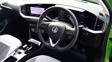
When the Mokka-e launched in 2020, it established a new design language for Vauxhall’s latest models, particularly the new ‘Pure Panel’ infotainment display. Similar to the interior layout of the latest Mercedes A-Class, the Mokka-e's cabin features two screens housed within a single panel. You get one eight-inch screen for infotainment and another eight-inch unit behind the steering wheel.
It’s worth noting, though, that a facelift for the e-Niro in 2020 brought a revised dashboard design, which can now accommodate a larger information display up to 10.25 inches in size. However, lower-spec versions like the one we tested come with an eight-inch unit, just like the Mokka-e's.
Overall, the e-Niro's facelift freshened up the interior significantly, but it's still very conservative and can’t compete with the likes of the Mokka-e, next to which it just feels underwhelming. We must say that the piano-black finish used for much of the Mokka-e’s dashboard perhaps isn’t our favourite, but it's the only option in this case.
This next part is a bit more subjective, as the Mokka-e features a slightly sportier seating position, while the e-Niro’s driving position is more elevated. Which you’d want to live with depends on your own preferences.
We strongly welcome the decision to stick with physical buttons to operate the climate control in both cars in this test, as we're not fans of the current craze for some electric to use touch-sensitive sliders or touchscreens for this job.


