BMW i4 vs Tesla Model 3 vs Polestar 2: interior and infotainment
While each infotainment setup here has its own merits and drawbacks, the BMW’s impeachable build quality put it well ahead of the pack
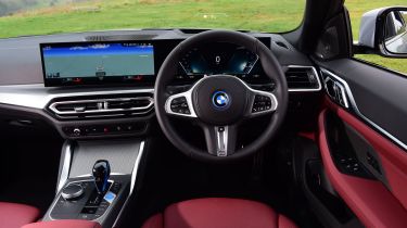
The i4’s cabin boasts the same flawless build quality you’d expect from BMW that neither the Polestar or the Tesla can hold a candle to. You also get a great driving position that just feels right. Where things differ from the closely related 3 and 4 Series is the technology on board.
BMW’s electric sports saloon gets the same dual-screen setup as its flagship iX luxury SUV, incorporating 12.3-inch digital instruments and a 14.9-inch touchscreen into one seamless, gently curving display. It looks stunning, and unlike its rivals here, manages to strike a usable balance between contemporary touchscreen functions and the iDrive rotary dial and shortcut buttons. These are so intuitive that they barely need a second glance to use. The screens look fantastic and the graphics are clear – although some drivers who are used to BMW’s simple analogue dials might think the semi-hexagonal speedometer design is a little fussy.
If you’re a fan of Apple CarPlay or Android Auto, apps are fully integrated into the main touchscreen, and they both look and function brilliantly as a result. The icons on the main menu are a little small, but otherwise the on-screen keys are well thought-out. The climate controls on the central touchscreen are painless to use, but we’re always going to prefer physical buttons.
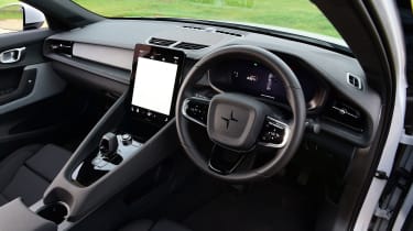
Polestar has close ties with Volvo, and that’s especially clear when you plonk yourself in the driver’s seat. Inside, the smart steering wheel, chunky door handles and excellent seats are all very Volvo. The cabin design toes the line between being understated and minimalist without looking too bare. While the overall feel doesn’t quite match the BMW’s for finish, it feels more sturdy than the Tesla’s interior. The driving position is also slightly raised compared to the i4’s, closer to that of an SUV perhaps, so it’s less sporty, but that isn’t necessarily a criticism.
Polestar went a different route with its in-car technology, having Google create the operating system. Behind the steering wheel is a 12.3-inch digital driver’s display with crystal-clear graphics and a fullscreen map function that means you only need to look at the screen in front of you.
However, the 11.5-inch central touchscreen is still excellent. It’s split into four quarters, showing Google Maps, Google Search, phone and media controls. The system loads quickly and brings up postcode searches or other specific points of interest with ease, plus it can adapt a chosen route based on real-time traffic changes. Access to other functions such as drive settings and external cameras is through shortcuts at the top of the screen, while climate controls can be adjusted at the bottom. Overall, it mostly works smoothly and easily, but in this company, the display is relatively small. The 11.5-inch unit may be a decent size compared with many other cars on the market, but here it means some keys are smaller than they would be on the BMW’s and Tesla’s larger displays, making the Polestar slightly fiddlier to use.
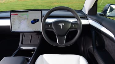
But if any of these car’s cabins deserves to be labelled cutting-edge, it’s the Tesla Model 3 and its still somewhat controversial 15-inch touchscreen. The enormous screen has the processing power to match its high-resolution graphics; loading times when plotting a route are rapid, with minimal latency responding to touches, pinches and swipes. The Tesla’s navigation system can also pre-plan a top-up at a Supercharger if there isn’t sufficient energy for a journey, which is particularly handy.
Roughly a third of the screen is reserved for driving information like your speed and any info from the Tesla’s numerous sensors and cameras around the body. Some will prefer to have a traditional instrument panel right in front of them on a separate screen, but the numbers on the Model 3’s screen are large, so they’re not that hard to spot out of the corner of your eye. What’s perhaps more irritating at times is the near-total lack of physical controls. For example, the glovebox can only be opened via the touchscreen or voice commands, and there aren’t any physical controls for the heated rear seats – those in the back have to ask someone up front to adjust them through the display.
Tesla has thankfully ditched the fingerprint-prone, piano-black surfaces found in early Model 3s for matte-black materials, but overall the feel of the interior is the same. The delightfully soft and squidgy seats still feature, and you do get plenty of cabin space, making this the best car here for seating five. Build quality has also improved considerably compared to Teslas from a few years ago, but still falls short of the immaculate finish of the BMW.
