BMW 530e vs Mercedes E 300 e: interior and infotainment
These are two fantastic cars to spend time in, but the BMW's better infotainment system sees it edge ahead

The BMW is best here, too, although only by a fraction. Both cars have great driving positions, with heated seats and partial power-adjustment. We’d like BMW to fit standard adjustable lumbar support as Mercedes does (it’s part of a £1,995 Comfort Pack on the BMW), but the 5 Series is still a comfortable car by any measure.
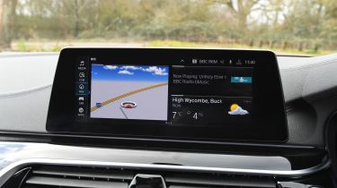
It also has the more logical dashboard interface, with an intuitive switch layout and infotainment system. The 12.3-inch touchscreen and rotary-dial controller combination is easy to use, and the screen has graphics that would shame plenty of HD televisions.
There are some annoying quirks, such as the standard Apple CarPlay being difficult to activate, but generally it’s one of the best systems to use. Android Auto isn’t an option, which does let it down.
The Mercedes isn’t far behind at all, with a similarly huge, glossy screen offering sharp graphics and more generous standard equipment given that both Apple CarPlay and Android Auto are included.
The digital driver’s display is also more configurable than the BMW’s, but notably the voice command aspect of the standard Mercedes 'Audio 20' system is quite poor, and it’s sometimes trickier to use the rotary dial and touchpad combination rather than a touchscreen.


