Hyundai Ioniq Hybrid vs Toyota Prius Hybrid: interior and infotainment
The Hyundai Ioniq takes the win here, with a revised interior and far superior infotainment

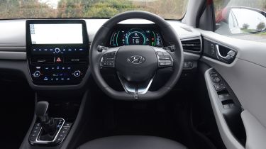
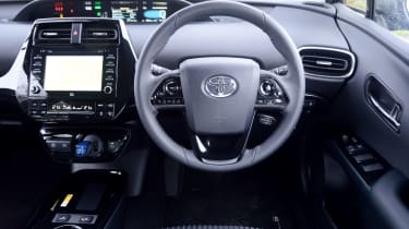
Part of the Hyundai Ioniq’s recent facelift was its redesigned interior – better materials, a more streamlined dashboard and a larger infotainment screen are the highlights. It’s a nicer place to be than the Toyota Prius' rather fussily designed interior, although the Toyota still brings an equivalent level of build quality.
Both companies have also clearly prepared their offerings for family or taxi use – hard-wearing plastics are the order of the day. The Hyundai feels a little plusher in terms of material quality, but both are equally well screwed-together.

The Ioniq’s infotainment system is much better than the Prius’. The 10.25-inch screen is sharp and clear, as is the accompanying seven-inch driver’s display.
The system itself is easy to use and nowhere near as confusing as some others on the market; it’s stuffed with features, but remains easy to navigate thanks to clear menus and snappy responses. Android Auto and Apple CarPlay are standard and each works well.
By contrast, the Toyota’s system seems a little dated. It feels overly complex next to the Ioniq’s, while the small display isn’t the easiest to read. It’s slow in operation and just can’t match its rival for ease. We’re fans of the upper display, though, even if the Ioniq’s squarer display mounted behind the steering wheel makes more ergonomic sense.


