Skoda Citigo-e iV vs Volkswagen e-up!: interior and infotainment
These cars are showing their age; a crafty smartphone holder can’t detract from a distinct lack of in-car technology

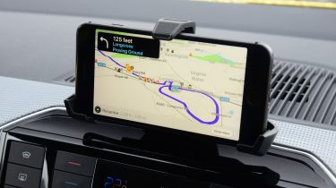
Take a look inside the Skoda Citigo-e iV or Volkswagen e-up! for the first time and you’ll be surprised by the spartan design and complete lack of in-car technology. No matter which model you go for – Citigo-e or up!, entry-level or top-spec – there's no touchscreen infotainment system; a small colour display and a crude plastic smartphone holder is all you get.
This setup isn't without its advantages, of course. Being able to place your phone on the dashboard each time you get in means you can simply stream music and maps straight from your chosen device. There’s a handy USB slot right behind it, so there’s no need for unsightly wires draping down the front of the dashboard, either.
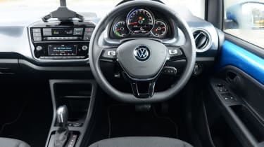
As mentioned, both cars get a colour display below the climate control, which gives the driver and passenger access to the car’s Bluetooth connectivity and radio settings. The Skoda’s is ever-so-slightly larger, but the Volkswagen comes with a built-in reversing camera. A nice-to-have – but as these cars are so small and easy to park in the first place, we wouldn’t consider this a deal-breaker.

Both cars get smartphone apps: Skoda Connect allows owners to check things like their car’s state of charge, as well as offering a pre-conditioning function that can heat or cool the cabin ahead of time. Volkswagen's Maps + More does exactly the same, as well as offering a ‘Think Blue Trainer’, which coaches you how to drive more economically.
There are lots of dark plastics, but the flashes of colour on the doors liven things up – especially on our bright yellow Skoda test car. Quality is good, however, with leather on the steering wheel and gearlever and soft plastics on the dashboard. The dials are a little dull in design, but they’re clear and easy to read.


