Polestar 2 vs Tesla Model 3: interior and infotainment
Minimalist, infotainment-centric design is the order of the day for both cars; Polestar pips Tesla for quality

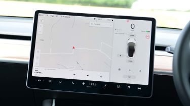
Tesla has a patchy history with fit and finish, but things have improved in recent years and the Model 3 is among the best in the manufacturer's range. There's no denying the appeal of the sparseness of its cabin – simple lines, a lack of extraneous buttons, a large, single air vent and a huge infotainment screen that would have passed for a television a few years ago. Like the Polestar, the Tesla eschews leather in the name of fashionable vegan alternatives, but the overall quality of the materials used can't quite match that of the 2. We like the wood trim, though.
The Polestar's Volvo roots can be discerned in its interior design but it's still different enough to feel special. The overall design is similarly minimalist, but the materials and plastics used are of a higher quality and better put together. The Polestar's infotainment system controls most functions, much like the Tesla; powered by Android, it's snappy, logical and easy to use, with the added benefit of Google Maps navigation and seamless Android Auto integration – but no Apple CarPlay yet.
The Model 3 doesn't offer any brand-name smartphone integration, with Tesla preferring to use its own system. The same story goes for its sat-nav, which actually works very well. The Tesla's lack of a driver's display takes a little getting used to, but generally works well, too.


