Vauxhall Corsa-e vs Renault ZOE: interior and infotainment
The ZOE inches ahead on interior quality, and smartphone connectivity bolsters both infotainment set-ups

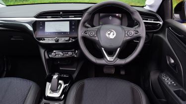
The Renault ZOE costs a little more to buy than the Corsa-e, but it justifies that with impressive interior quality. It’s immediately clear when you get in that the dash plastics are softer and bring a more modern, high-quality environment. The harder plastics in the Corsa-e mean it doesn’t feel as high-quality as its rival, even though you get plenty of standard kit.
Both cars score well for infotainment, although the ZOE’s touchscreen and digital dials are brighter and sharper overall. Android Auto and Apple CarPlay are present in both cars, and thanks to the touchscreen displays it works well. The ZOE’s slightly sharper screen means these systems look better but it’s a small difference and the functionality is the same.
Both cars use physical air-con controls, which is great to see as it avoids having to fiddle with the touchscreen while driving. Whether you prefer the look of the widescreen display in the Corsa-e on the dash – or the portrait-style display in the ZOE – is up to personal preference.


