BMW iX vs Audi e-tron Sportback: interior and infotainment
Audi’s interior still impresses, but BMW’s effort feels more luxurious and futuristic
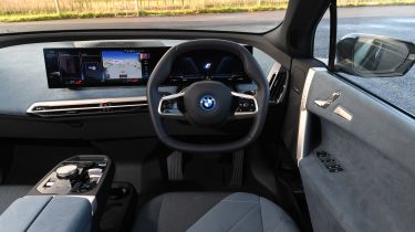
Whatever you think of the iX’s radical exterior looks, its interior is much less divisive. Design and quality are both top-notch and the whole thing feels very futuristic, with twin curving display screens set across the top of the dashboard dominating proceedings. Elsewhere, extensive use has been made of soft, suede-like materials, and while the steering wheel looks oddly shaped at first glance, it feels fine in your hands.
Both of the BMW’s screens feature extremely crisp graphics and are responsive to use, which you can do by either by tapping the central touchscreen or using the rotary dial on the centre console. Apple CarPlay and Android Auto are standard, too, so smartphone integration is easy – however, the sheer amount of functions, icons and submenus in BMW’s latest iDrive 8 system can feel overwhelming to navigate, making the system challenging to use on the move at times.
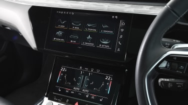
The interior was one of the most impressive aspects of the e-tron when it first launched back in 2019 – no surprise for an Audi – and it’s still one of the car’s strong points today. But it can’t help now feeling a little bit behind the curve compared to the cutting-edge cabin of the BMW. And while its infotainment interface (which also allows for Apple or Android smartphone integration) is slick-looking and easy to navigate, we’re not quite sold on the ‘haptic’ touchscreen, which requires a firm prod to activate. It feels like the engineers have tried to marry the feel and functionality of a button with the convenience of a touchscreen, without much success.

