Toyota Prius Plug-In (2016-2022) interior, dashboard & comfort
The Toyota Prius Plug-in Hybrid has some fairly major flaws inside the cabin compared with its main rivals
We’ve already seen that the Toyota Prius Plug-in offers usability in many forms, not least its electric range and efficiency, but there are some drawbacks. Quality, infotainment and practicality are all issues compared with its main plug-in hybrid rivals – here’s why.
Toyota Prius Plug-In dashboard
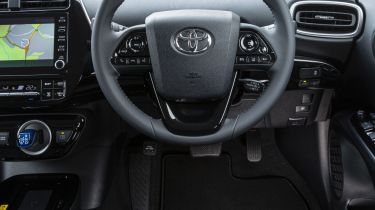
Following on from the Toyota Prius Plug-In’s clever engine and motor that we’ve already seen, you’d be within your rights to expect some advanced infotainment and lots of tech inside. However, that’s not quite the case. There’s the minimum of tech that you’d expect, but the way it works isn’t quite as up to date as we’d like. It broadly shares its dashboard layout with the standard Prius, and this is a problem that car suffers from as well.
In the middle of the dashboard under the windscreen there’s a digital instrument pack, which has become a Prius family trademark over the years. It’s been developed even further for this most advanced model yet, too. The 4.2-inch digital display isn’t huge so it doesn’t dominate the dash or interrupt your view of the road, but it does give some useful info on speed and revs while you can also cycle through the different displays for more data on efficiency and battery charge, for example.
This gives you an idea of where your power is coming from (electric motor and/or combustion engine) as well as the flow of energy when you lift off or brake so it gives you a good idea of how to maximise the hybrid system’s efficiency to boost economy. It’s not all positive though. The display resolution is grainy and not as slick as some rivals with digital dashboards. It could and should be sharper and crisper as a car that represents the future of motoring.
Equipment, options and accessories
Our pick of the line-up, Business Edition Plus, gets plenty of standard kit, which is why we wouldn’t spend the extra to upgrade to the Excel model. This is effectively the entry-level model in the range, but take this with a pinch of salt as you get lots of standard features. The list of kit includes keyless operation, a seven-inch touchscreen with sat-nav, DAB, Bluetooth and wireless phone charging. The safety tech is strong too, as collision warning with autonomous braking and adaptive cruise is part of Toyota’s Safety Sense package.
Upgrading to Excel adds a more powerful 10-speaker JBL stereo, front and rear parking sensors with park assist and heated and cooled seats. The Prius Plug-In Business Edition Plus was originally available with a solar roof panel for improved efficiency, however that option was dropped back in 2019.
Infotainment, apps & sat nav
Like the smaller dashboard-mounted screen, the car’s seven-inch central touchscreen isn’t the highest resolution and the graphics look fuzzier than in its rivals. This means the Prius Plug-in gives away points to its rivals when it comes to the infotainment and multimedia. The menu layout isn’t the most logical, while the screen sometimes can lag behind your inputs.
This is made even worse by the fact that there aren’t any physical buttons surrounding the screen. Instead there are touch-sensitive buttons to use for features such as the volume, which is a little awkward and can result in quite a few prods of the screen. It’s better to use the steering-wheel controls as a result.
For years, Toyota resisted adding Apple CarPlay and Android Auto connectivity to its cars, but since November 2020, both systems have been standard on the Prius Plug-In, meaning you can avoid many of the drawbacks discussed above by just using your own phone apps for navigation and entertainment instead.


