Renault Megane E-Tech review: interior, dashboard & infotainment
Renault’s new Google-powered infotainment system is slick, intuitive and overall one of the best we’ve tried
Compared to the outgoing Renault ZOE, the Megane E-Tech’s interior quality is an astronomical leap forward. This is helped by the fact that the doors and switchgear all have a weighty feel to them. There are a lot of plastics used throughout the cabin, but the same is true of the MG4 EV and Volkswagen ID.3, and the Renault’s cabin design is significantly more impressive than either. Add to that a Google-powered infotainment system that sets a new benchmark in this class, and Renault has knocked it out of the park with the electric Megane’s interior.
Renault Megane E-Tech dashboard
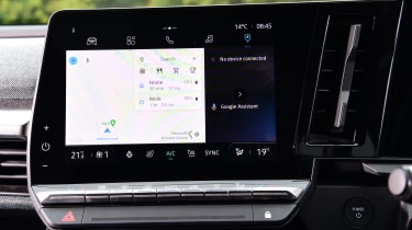
Renault introduced its new driver-focused cockpit design with the Megane E-Tech. Here it pairs a 12.3-inch digital instrument panel with a nine-inch central touchscreen, the latter being heavily angled towards the driver. Below that is a row of physical climate controls, which are a welcome addition to an already very functional cabin. In fact, all the buttons in the Megane’s cabin are easy to use – unlike the Cupra Born or Volkswagen ID.3’s infuriating touch-sensitive switchgear.
Other nice details include the use of textured fabric for the dashboard itself, which looks nicer than the usual leather or plastic. The steering wheel is a slightly unusual shape but looks great and is comfortable to hold, though having four separate stalks behind it for the gear selector, indicators, media controls and wipers, as well as the paddles of the regenerative braking, is a bit messy. That said, you needn’t worry about going into reverse when trying to turn your wipers on.
Equipment, options & accessories
There's four trim levels to choose from with the Megane E-Tech – Equilibre, Techno, Techno+ and Iconic. Entry-level Equilibre cars come with loads of kit including a nine-inch touchscreen, a 12.3-inch digital instrument cluster, LED headlights, heated front seats and steering wheel, a reversing camera, wireless Apple CarPlay and Android Auto, 130kW rapid charging, and the functionality for over-the-air updates.
However, we’d recommend at least upgrading to the Techno trim if you can because it gets additional Google services like built-in navigation, as well as 20-inch alloys, chrome exterior trim, adaptive LED headlights, customised driving modes, 48-colour ambient lighting, wireless smartphone charging, plus adaptive cruise control, blind-spot recognition and rear cross-traffic alert. Our pick of the lineup, however, is the Techno+ model as this also comes with a heat pump which should enable the Megane E-Tech to get much closer to its claimed range in colder temperatures. This will eventually replace the standard Techno and is available at no extra cost over that model.
Finally, there’s the new range-topping Iconic specification. These models get the same styling tweaks as the recently-discontinued Launch Edition, including a set of 20-inch rims and gold ‘F1 blades’ Springing for the Iconic trim also gets you more paint options, including a two-tone paint scheme with a choice of a diamond black or shadow grey roof. The main reasons for picking the Iconic trim, however, are the additions of a 360-degree camera system, a digital rear-view mirror and an upgraded Harman Kardon stereo.
Infotainment, apps & sat nav
The Megane E-Tech uses a brand-new, Google-powered infotainment system and it’s quite simply one of the best we’ve tested. It’s called OpenR Link, and based on Android Automotive OS, much like the system found in the Polestar 2. The nine-inch central touchscreen is quick to respond and the graphics are super sharp, and all the menus are easy to navigate and use because they’re laid out like the menus on a smartphone.
All but the base model also come with additional Google services like Google Maps built-in, with the option of a full-screen map display for the 12.3-inch instrument panel. Android Auto and Apple CarPlay connectivity come as standard, too, but the Renault’s system is so good you’re not that likely to use either.
If we’re being picky, the only drawback – if this can be considered a ‘drawback’, per se – is that UK cars get a smaller nine-inch display, while Euro-spec models – as well as the forthcoming Renault Scenic – boast a larger 12-inch portrait touchscreen. There’s nothing overtly wrong with the smaller setup, but we’d certainly appreciate the extra screen real estate, especially given rivals like the Smart #1 have screens measuring upwards of 12-13 inches.


